Nuxt v3 簡易使用教學Nuxt v3 讓網頁支援 markdownNuxt v3 + content v2 = 最簡單 markdown 網站Nuxt v3 + content v3 = 很難搞的 markdown 網站Nuxt v3 + Tailwindcss v3Nuxt v3 + Primevue v4客製化 Prose 等 UI 元件安裝 @nuxtjs/i18n v8客戶端 Nuxt 3 擷取 REST APIs 數據設計主機端 Flask REST APIs 設計Flask 限制 API 使用次數Flask JWT 登入登出 API
PublishedDate: 03 April 2025
Nuxt v3 + Primevue v4
為什麼要選擇 Primevue UI 呢?在之前用 vite 或 webpack 來開發 vue 網站,選到 Primevue ,又藉由 Primevue 才知道 Nuxt,因為已經稍微習慣 Primevue 所以繼續使用它。
安裝與設定
- 安裝
npx
npx nuxi module primevue @primevue/themes primeicons
yarn
yarn add primevue @primevue/themes primeicons
- 設定
nuxt.config.ts
// nuxt.config.ts
import Aura from '@primevue/themes/aura';
export default defineNuxtConfig({
  modules: ['@primevue/nuxt-module'],
  primevue: {
    options: {
      theme: {
        preset: Aura,//Nora//Lara//Aura
        options: {
          // darkModeSelector: false || 'none', // 無 dark mode
          darkModeSelector: '.dark-mode', // 開關模式
        }
      },
    }
  },
  css: [
    // primeicons v3
    // '/node_modules/primeicons/primeicons.css',

    // primeicons v4
    'primeicons/primeicons.css',
  ],
  //
})
- 測試頁面
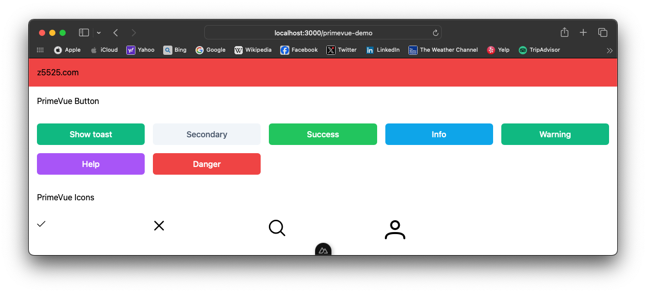
app/pages/primevue-demo.vue
<!-- app/pages/primevue-demo.vue -->
<template>
  <div>
    <h1 class="p-4 bg-red-500">z5525.com</h1>
  </div>

  <h2 class="p-4">PrimeVue Button</h2>
  <div class="p-4 grid grid-cols-5 gap-4">
    <Button label="Show toast" @click="show()" />
    <Button label="Secondary" severity="secondary" />
    <Button label="Success" severity="success" />
    <Button label="Info" severity="info" />
    <Button label="Warning" severity="warning" />
    <Button label="Help" severity="help" />
    <Button label="Danger" severity="danger" />
  </div>

  <h2 class="p-4">PrimeVue Icons</h2>
  <div class="p-4 grid grid-cols-5 gap-4">
    <i class="pi pi-check" style="font-size: 1rem"></i>
    <i class="pi pi-times" style="font-size: 1.5rem"></i>
    <i class="pi pi-search" style="font-size: 2rem"></i>
    <i class="pi pi-user" style="font-size: 2.5rem"></i>
  </div>
  <Toast />
</template>
<script setup>
const toast = useToast();
const show = () => {
    toast.add({
        severity: 'success',
        summary: 'Info',
        detail: 'Message Content',
        life: 3000
    });
}
</script>
- 測試
yarn dev
日夜主題開關 light/dark 模式
Primevue 雖然是使用 但是專案中兩個都有使用需要兩個都一起控制,由於這個比較複雜點,分開兩個部分說明,簡化設定以及更好理解原理。
Tailwindcss v3 日夜主題控制
請看這篇Tailwindcss v3
Primevue v4 日夜主題控制
- 設定
nuxt.config.ts 控制檔案中 primevue 加入 darkModeSelector: '.dark-mode
nuxt.config.ts
// nuxt.config.ts
import Aura from '@primevue/themes/aura';
export default defineNuxtConfig({
  primevue: {
    options: {
      theme: {
        preset: Aura,//Nora//Lara//Aura
        options: {
          // darkModeSelector: false || 'none', // 無 dark mode
          darkModeSelector: '.dark-mode', // 開關模式
        }
      },
    }
  }
})
- 新增切換主題共用功能
在 composables 目錄之下,新增一個檔名 usePrimevueTheme.ts
,命名規則建議採用同樣的規則,使用的名稱與檔案名稱一樣。
app/composables/usePrimevueTheme.ts
// app/composables/usePrimevueTheme.ts
export const usePrimevueTheme = () => {
  const theme = useState('theme', () => 'light'); // 預設為 light

  const toggleTheme = () => {
    theme.value = theme.value === 'light' ? 'dark' : 'light';
    if (process.client) {
      // 切換 <html> 的 dark-mode 類
      document.documentElement.classList.toggle('dark-mode', theme.value === 'dark');
      // 客戶端儲存 localStorage
      localStorage.setItem('theme', theme.value);
    }
  };

  const initTheme = () => {
    if (process.client) {
      const savedTheme = localStorage.getItem('theme');
      const prefersDark = window.matchMedia('(prefers-color-scheme: dark)').matches;
      theme.value = savedTheme || (prefersDark ? 'dark' : 'light');
      document.documentElement.classList.toggle('dark-mode', theme.value === 'dark');
    }
  };

  return { theme, toggleTheme, initTheme };
};
- 新增開關UI元件
在 components 目錄之下,新增一個檔名 PrimeVueThemeToggle.vue
app/components/PrimeVueThemeToggle.vue
<!-- app/components/PrimeVueThemeToggle.vue -->
<template>
<Button
  :label="theme === 'light' ? 'PrimeVue Switch to Dark' : 'PrimeVue Switch to Light'"
  @click="toggleTheme"
  class="p-button-sm"
/>
</template>

<script setup>
import Button from 'primevue/button';
const { theme, toggleTheme, initTheme } = usePrimevueTheme();

// 初始化主題
onMounted(() => initTheme());
</script>
- 新增一個測試頁面
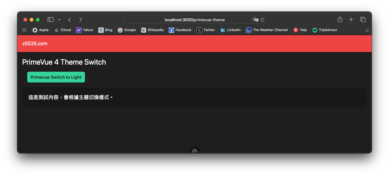
app/pages/primevue-theme.vue
<!-- app/pages/primevue-theme.vue -->
<template>
  <div>
    <h1 class="p-4 bg-red-500">z5525.com</h1>
  </div>
  <div class="p-4">
    <h1 class="text-2xl">PrimeVue 4 Theme Switch</h1>
    <ThemeToggle />
    <Card>
      <template #content>
        <p>這是測試內容,會根據主題切換樣式。</p>
      </template>
    </Card>
  </div>
</template>

<script setup>
import Card from 'primevue/card';
import ThemeToggle from '~/components/PrimeVueThemeToggle.vue';
</script>
- 測試
yarn dev
Tailwindcss v3 + PrimeVue v4 主題切換整合
- 加入整合主題切換功能元件
app/composables/useTheme.ts
// app/composables/useTheme.ts
export const useTheme = () => {
  const theme = useState('theme', () => 'light'); // 預設為 light

  const toggleTheme = () => {
    theme.value = theme.value === 'light' ? 'dark' : 'light';
    if (process.client) {
      // 切換 <html> 的 dark-mode 類
      // PrimeVue
      document.documentElement.classList.toggle('dark-mode', theme.value === 'dark');
      // TailwindCSS
      document.documentElement.classList.toggle('dark', theme.value === 'dark');
      // 用 localStorage 儲存
      localStorage.setItem('theme', theme.value);
    }
  };

  const initTheme = () => {
    if (process.client) {
      const savedTheme = localStorage.getItem('theme');
      const prefersDark = window.matchMedia('(prefers-color-scheme: dark)').matches;
      theme.value = savedTheme || (prefersDark ? 'dark' : 'light');
      document.documentElement.classList.toggle('dark-mode', theme.value === 'dark');
      document.documentElement.classList.toggle('dark', theme.value === 'dark');
    }
  };

  return { theme, toggleTheme, initTheme };
};
- 加入 TailwindCSS 設定與檔案
看這篇TailwindCSS 加入與。
app/composables/useTailwindTheme.ts
app/components/TailwindThemeToggle.vue
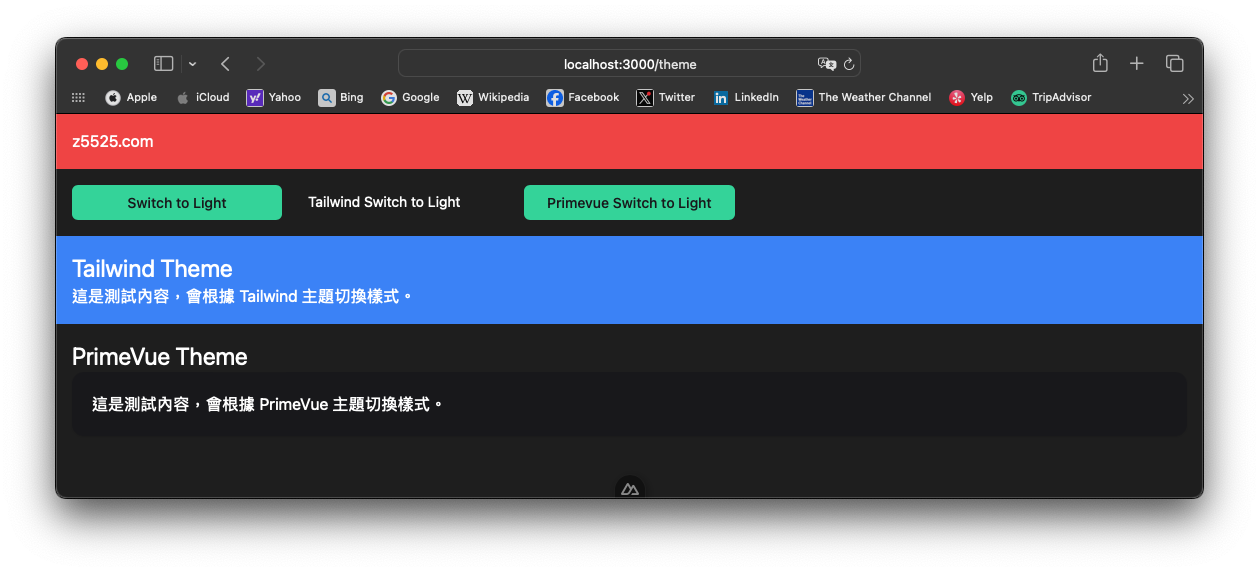
- 主題控制頁面
寫一個可分別測試 TailwindCSS 主題控制與 Primevue 主題控制,外加一個控制兩個主題的按鈕。
app/pages/theme.vue
<!-- app/pages/theme.vue -->
<template>
  <div>
    <h1 class="p-4 bg-red-500">z5525.com</h1>
  </div>
  <div class="p-4 grid grid-cols-5 gap-4">
    <ThemeToggle />
    <TailwindThemeToggle />
    <PrimeVueThemeToggle />
  </div>
  <div class="p-4 dark:bg-blue-500">
    <h1 class="text-2xl">Tailwind Theme</h1>
    <div>
      <p>這是測試內容,會根據 Tailwind 主題切換樣式。</p>
    </div>
  </div>
  <div class="p-4">
    <h1 class="text-2xl">PrimeVue Theme</h1>
    <Card>
      <template #content>
        <p>這是測試內容,會根據 PrimeVue 主題切換樣式。</p>
      </template>
    </Card>
  </div>
</template>
<script setup>
import Card from 'primevue/card';
import PrimeVueThemeToggle from '~/components/PrimeVueThemeToggle.vue';
import TailwindThemeToggle from '~/components/TailwindThemeToggle.vue';
</script>
最後結果
參考資料 Reference
版本備註
nuxt v3.15.4
@primevue/nuxt-module v4.2.5
primevue v4.2.5
primeicons v7.0.0
@primevue/themes v4.2.5
@nuxtjs/tailwindcss v6.13.1